A journey to a new blog design: Welcome to the new Sideways Thoughts!

The journey to here
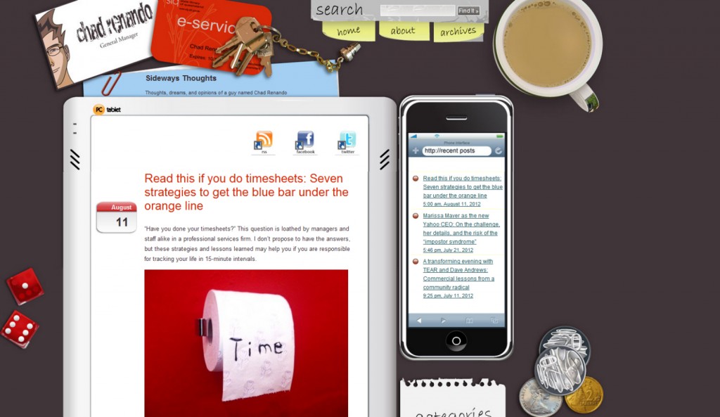
Has it really been three years since I started this blog? That’s like forever in digital dog years. My old design (captured below for posterity) was in place a month after I launched and I loved it like a familiar shirt.

Like any item you wear over your identity, be it clothing or a blog, I started to question whether the design matched who I was becoming. The old design was that it was very much “Chad on Sideways Thoughts”, even as links to the blog made reference to Sideways Thoughts.
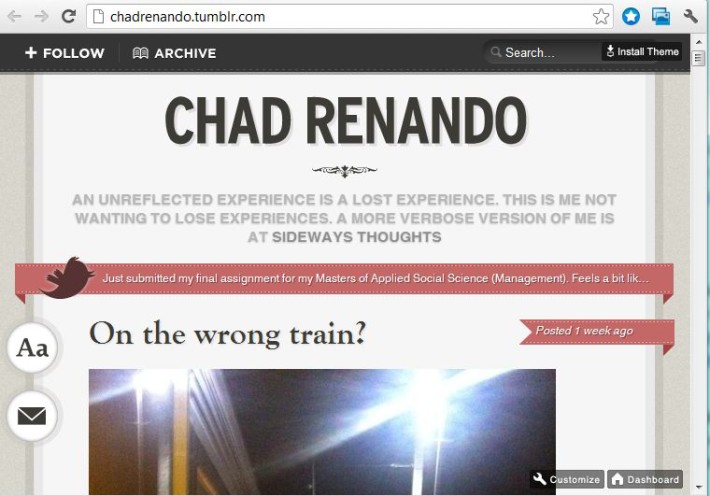
I also found my original intent of quirky expressions no longer seemed to fit what I was talking about. I wanted to share about random creative observations, even as my content evolved into a serious dissertation of social and commercial critique driven by my management role and post-graduate studies in applied social science. This fragmentation caused me to start a Tumblr blog that acted like a sketch pad for my thoughts.
Why I joined, and quit, Tumblr

At first I loved my new-found freedom of self-expression. I was no longer bound by my self-imposed restrictions on who I believed I should be. A few weeks into my seemingly new-found freedom, however, I started hearing feedback from those reading my Tumblr posts that the material felt very much like Sideways Thoughts. I discovered an awkward truth many discover as they jump job to job: no matter where you go, there you are.
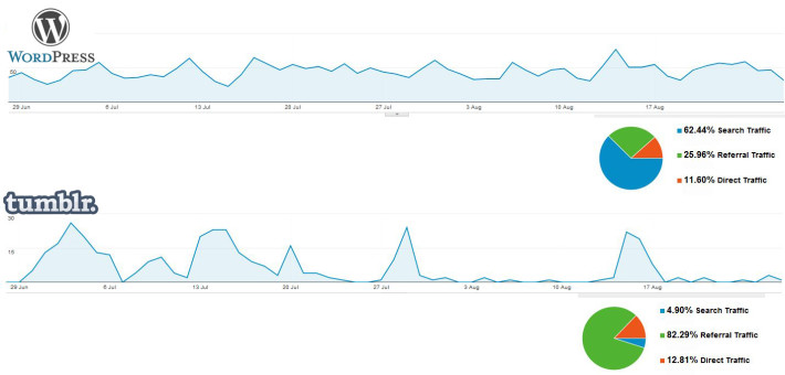
I also felt technically and promotionally constrained by Tumblr. I accept my Tumblr blog was new, but any traffic apart from direct referrals from my posts was somewhat underwhelming. WordPress by comparison maintained a steady stream of search engine traffic without needing my constant prodding. Tumblr promotes providing access to other users on Tumblr, but I only had two people from the Tumblr community follow me during my short stint, one of which was one of my work colleagues.

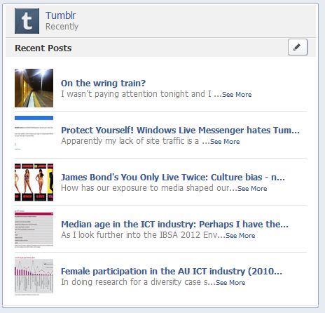
Tumblr also touts integration with Facebook. However, I found that unless I physically copied and pasted my Tumblr blog post links into Facebook, they would not show up in people’s newsfeeds due to Facebook’s rules around limiting links that are not specifically “promoted”. Even when I did post a link, those who receive their Facebook updates through Microsoft instant messaging software would get errors due to Microsoft not trusting Tumblr blogs by default.

Details of the new design
So with that in mind, I celebrated submitting my final Masters’ assignment last weekend by purchasing a new blog theme. Theresa had thankfully done the hard yards of short listing a few designs for me to choose from when she redesigned her own blog a few weeks back.
I was looking for something that would allow me to feature recent and past posts, have flexibility in isolating specific categories, and take the emphasis off me as a person and more on the content being produced. I was also after something that would be responsive to mobile, given that mobile was steady over 10% of the total visitors to my site.
We settled on the Lightly theme and I couldn’t be happier. The $40 was a small investment and the support from the developer has been incredible.
I refined my categories I had defined back in 2010 and placed them in the top navigation. I am using the header strip to just show latest posts, but I may refine this in the future. I am using the main feature strip for five posts that are top of mind. The theme developer also added just for me a feature to exclude categories from the recent posts to allow me to eventually incorporate my Blogger Fin Review review blog into Sideways Thoughts without polluting the main stream.
The hardest part of the exercise was switching my domain over from renando.com to sidewaysthoughts.com. This was the biggest step as I worried about starting over with search engines and losing my Facebook likes. I could not avoid losing my social media likes if I changed the URL, but I think I addressed SEO through setting up an alias, applying a 301 redirect into my blog config, and letting Google know about the change through my Google Webmaster tools. The fact that I moderately understand what I just said is a testament to the clever people I work with who helped me through the process.
Loving the logo: embracing my sideways “d”
If I was going to de-emphasise Chad’s smirking anime profile, I felt I needed a Sideways Thoughts logo to stick in its place. I asked the incredibly talented designer Theresa http://flavoryellow.com/ to see what she could do for a logo, and she hit the brief perfectly in only a few hours. The challenge was to represent something that was professional and respectable yet also fun, different and off-centre.
The previous design was “Chad’s Sideways Thoughts”, but I was unsure if I wanted to be “Sideways Thoughts” or “Sideways Thoughts”.
One of the original concepts favouring the latter emphasis on Thoughts is below.

I was leaning towards this design, until Theresa threw in the logo with the crooked “d” on a whim thinking I would not go for it. Yet the more I looked at it compared to the thought bubble above, the more I realised the crooked “d” is what I want for my next focus.
I got into digital over a decade ago to be creative, wanting to be more than an amateur animator. I enjoy the rewards of my General Manager position where I help develop people and build teams, but I am looking for more side expressions to flex the right-brain muscles. My intent is that this design will accommodate both.
I won’t purport to have a long-term strategy of where this is going (until I get there at which point I will be able to say I planned the whole thing). My focus now is just to enjoy the journey and be in the moment as much as possible.
If you got this far, then you have my sincere gratitude for being with me on the journey. Feel free to say Hi or Facebook like below.
Do you favour the old blog design or is this one a keeper? Are you more speech bubble or crooked “d”? Add your own sideways thoughts below!


I like the new design. Definitely like the sideways “d.” And the fact that it’s red. The whole logo made me smile. Good choice. 🙂
FYI: Not sure if it’s just me/my computer … but I don’t see a place to FB “like” this — “below” or otherwise. Unless you were thinking of people reading this while on FB … in which case, that would make sense … except I can’t read what you wrote unless I come to your blog, thus leaving FB. :/
Also … the “Get Social With Me” links at the top right aren’t colored on my computer. Are they on yours? Lack of color made it harder for me to find them. I was trying to find the blue FB “F” logo to “like” this blog entry … but the logo is not blue … so it took a while … probably as long as I have spent typing this entire comment … but since I’m not done commenting yet, I guess it didn’t take quite as long …
Also, I’m glad you’re not doing the Tumblr account. My internet filter wouldn’t let me onto Tumbler, so I didn’t get to read any of those. 🙁
Okay, I think I’m done commenting for now. Remember, you asked! 🙂 <3
Love you, bro!!
Okay, I think I'm done. Remember, you asked! 😉
Thanks Crystal! Got to love crowd-sourcing QA. 🙂
I think the FB thing is sorted, although there is a compatibility thing between any FB plug-ins and the theme I am working though. Sounds like Tumblr has issues from a few channels.
Thanks for the feedback and for following along on the journey! 🙂
Chad