The Myspace teaser video: A site for everyone if everyone’s a celebrity
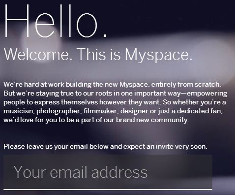
The teaser video for the new MySpace interface gave a sneak peek at a site that “puts the power to express yourself back in your hands”.
The video shows a hip, 20-something target demographic David Croft setting up a profile. After perusing his photos, David looks at what is trending, including a focus on Myspace owner Justin Timberlake.
I am all for competition in the social space and I like the look of the new interface. I do question, however, how much of the world reflects Timberlake’s strategy for his social project. Timberlake stated his vision in a June 2011 interview:
“There’s a need for a place where fans can go to interact with their favorite entertainers, listen to music, watch videos, share and discover cool stuff and just connect. Myspace has the potential to be that place. Art is inspired by people and vice versa, so there’s a natural social component to entertainment. I’m excited to help revitalise Myspace by using its social media platform to bring artists and fans together in one community.”
Everyone is a celebrity
In the same way that Instagram made everyone a photographer, the new MySpace has potential to make everyone a celebrity. The yet-to-be-released layout makes ordinary content extraordinary. My personae is presented to the world in an identical manner as Timberlake, allowing me to feel as though I can be a star just like him.
It is not so much that content is king but that my content is king. Technology is no longer the feature, but merely the delivery mechanism. New interfaces such as Pinterest or functionality such as circles released on Google Plus are easily replicable and do not offer a sustained competitive advantage for social media platforms. Audience engagement levels and the quality of content are now tradable commodities.
The video appears to position MySpace as a single portal for entertainment and expression. All photos, events, friends, and interests related to entertainment and self-gratification can be managed in Myspace. Similar to how console game systems aim to be “entertainment centres”, the nirvana of a social site is to realise as much engagement as possible within the greatest percentage of a specified audience.
The new Myspace could be reduced to a single critical perspective of getting consumers to purchase from entertainment providers. The success of the new site will be based on how many people reflect Timberlake’s vision of the future, how well the new Myspace features cater to those people, and to what extent their activity can be monotised.
But Myspace is not for everyone

The statement on the new site teaser makes it clear that the new MySpace is not for everyone.
“The site sets out to empowering people to express themselves however they want. So whether you’re a musician, photographer, filmmaker, designer or just a dedicated fan, we’d love for you to be a part of our brand new community.”
I see in this statement two conflicting sentiments that feel like a bait and switch. First, the site is for everyone to express themselves. Second, it defines “everyone” as “a musician, photographer, filmmaker, designer or just a dedicated fan”.
I do not fit into any of those categories. I am an American and Australian, a husband and father, a manager in a digital firm, a board member in a non-profit, and an amateur animator. It does not appear that the new Myspace is meant to be for me.
Something needs to change, however, as the old Myspace does not appear to be for anyone.
Lead by example?
Myspace is about the bands and the music, but even then it needs the audience. The bands also need to engage in the space. Owner Justin Timberlake has over 1.4 million friends on Myspace. This seems like a lot until it is compared to his 16.8 million likes on Facebook.


This is perhaps due to a lack of engagement, with Timberlake not updating his Myspace blog since 2009. If the owner is not using the features and he is the target audience, then I wonder how anyone else is expected to use it.

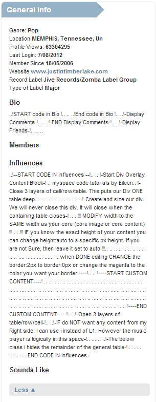
Myspace also suffers from what feels like a clunky interface, which is perhaps why Timberlake or his PR minders have not logged in for almost two months at the time of this post. Any activity he does have is though separate interfaces such as Twitter. His bio also has embarrassing code excerpts under the “Influences” section. I would expect all effort has been on the new site, relegating the current system to the code graveyard.

Revisiting my old Myspace
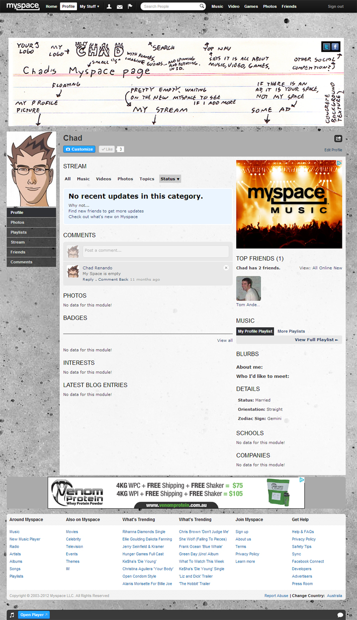
Before they pull the plug on the old MySpace, I felt I would give it one more spin with updating my own profile. It had not appeared to have changed much since last I looked.

In the old Myspace, I updated my marquee, changed the background image, listened to a few songs, watched a few videos, and left uninspired. The new Myspace is realising the vision of Timberlake where his fans can connect with him and artists like him. The old system never held my interest and, while I like the look of the new design, I suspect the new Myspace is not intended for me.
